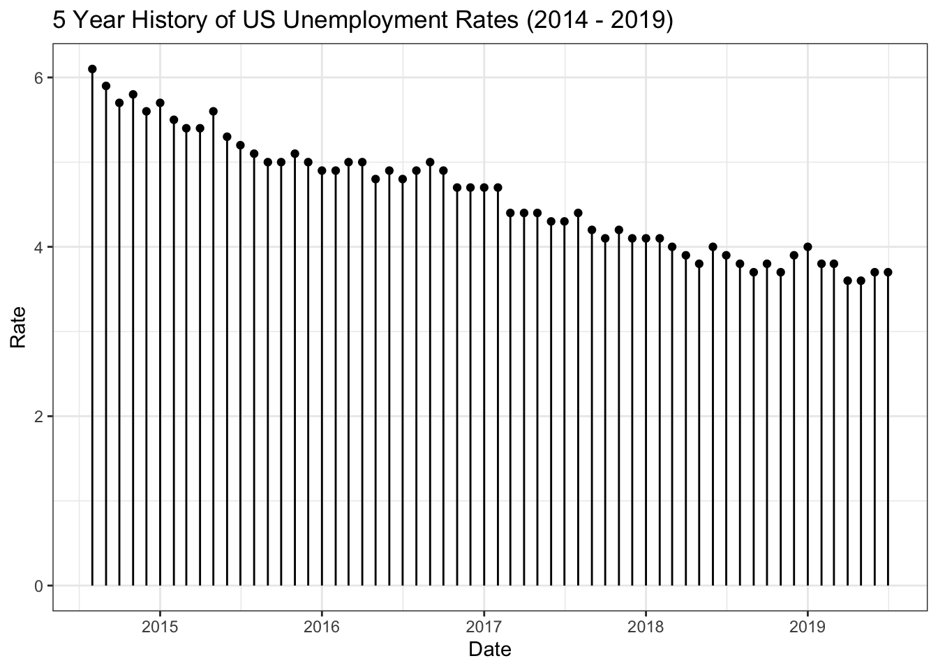
5 Yr History of US Unemployment: Lollipop chart

Data
This plot uses the us_unemp data frame of the gcubed package. This data frame contains unemployment rates for the United States published by the Bureau of Labor and Statistics. Rates are published monthly.
library(gcubed)
head(us_unemp)
## # A tibble: 6 x 2
## Date Rate
## <date> <dbl>
## 1 2009-08-01 9.6
## 2 2009-09-01 9.8
## 3 2009-10-01 10
## 4 2009-11-01 9.9
## 5 2009-12-01 9.9
## 6 2010-01-01 9.8To get only 5 years of rates, we filter:
df <- us_unemp[us_unemp$Date > as.Date("2014-07-01"), ]Code for plot
library(ggplot2)

unemp_plt <- ggplot(df, aes(x = Date, y = Rate)) + geom_point() +
  geom_segment(aes(x = Date, xend = Date, y = 0, yend = Rate)) +
  ggtitle("5 Year History of US Unemployment Rates (2014 - 2019)")  +
  theme_bw()


unemp_plt