Global life expectancy: Line chart

Data
This plot uses the life_ex data frame of the gcubed package. This data frame contains life expectancy data for numerous countries and groups of countries in the Entity column.
library(gcubed)
head(life_ex)
## # A tibble: 6 x 4
## Entity Code Year LE
## <chr> <chr> <dbl> <dbl>
## 1 Afghanistan AFG 1950 27.5
## 2 Afghanistan AFG 1951 27.8
## 3 Afghanistan AFG 1952 28.4
## 4 Afghanistan AFG 1953 28.9
## 5 Afghanistan AFG 1954 29.4
## 6 Afghanistan AFG 1955 29.9Code for plot
First, we will restrict the data set to only those rows that contain the life expectancy values for the country groups we are interested in. (Note that this filtering of rows could also have been done using base R.)
groups <- c("Upper-middle-income countries", "Middle-income countries", "Low-income countries",
  "Lower-middle-income countries","High-income countries")

library(dplyr)
df <- filter(life_ex, Entity %in% groups)
head(df)
## # A tibble: 6 x 4
## Entity Code Year LE
## <chr> <chr> <dbl> <dbl>
## 1 High-income countries <NA> 1950 64.3
## 2 High-income countries <NA> 1951 64.6
## 3 High-income countries <NA> 1952 65.1
## 4 High-income countries <NA> 1953 65.5
## 5 High-income countries <NA> 1954 66.0
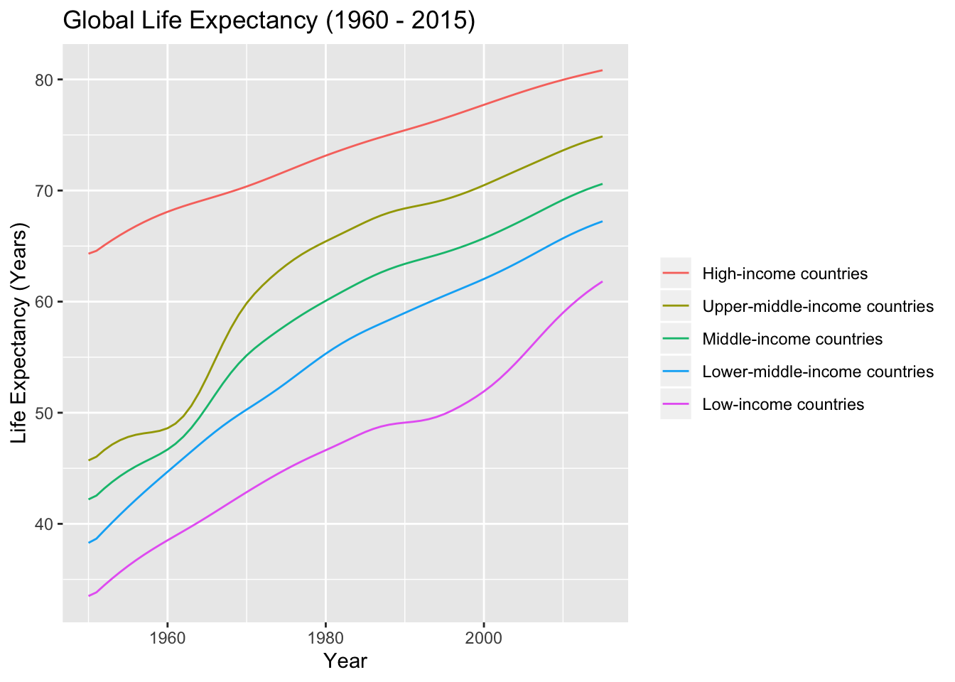
## 6 High-income countries <NA> 1955 66.4The data is already in the correct shape to be used by geom_line: all the life expectancy values are in the single column, LE. To get different lines for each income group, the group aesthetic is used in the creation of the ggplot object. To give each line a different colour, the colour aesthetic is used.
library(ggplot2)

le_plt <- ggplot(df, aes(x = Year, y = LE, group = Entity, colour = Entity)) +
  geom_line() +
  ylab("Life Expectancy (Years)") +
  ggtitle("Global Life Expectancy (1960 - 2015)") +
  theme(legend.title = element_blank())

le_plt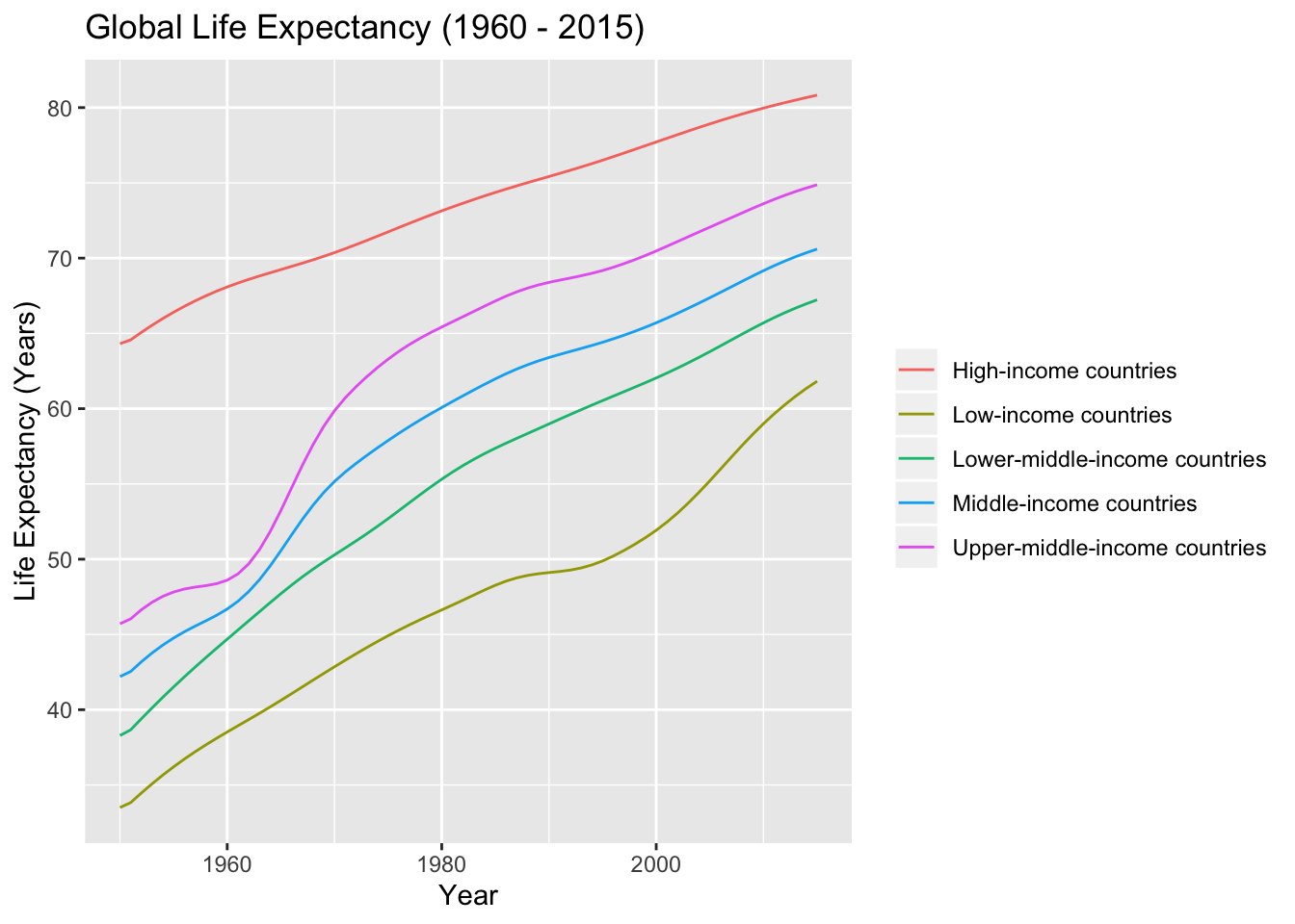
We can reorder the country groups so that the legend shows in the same order that the lines do in the plot.
library(ggplot2)
group_order <- c("High-income countries",  "Upper-middle-income countries", "Middle-income countries","Lower-middle-income countries", "Low-income countries")

df$Entity <- factor(df$Entity, levels = group_order)


le_plt <- ggplot(df, aes(x = Year, y = LE, group = Entity, colour = Entity)) +
  geom_line() +
  ylab("Life Expectancy (Years)") +
  ggtitle("Global Life Expectancy (1960 - 2015)") +
  theme(legend.title = element_blank())

le_plt