Life Expectancy for Selected Countries

Data
This plot uses the life_ex and regions data frames of the gcubed package. This data was originally obtained from Our World in Data.
First we join the two tables and select only the life expectancy values for 1950 and 2015.
library(gcubed)
library(dplyr)
le <- inner_join(life_ex, regions, by = c("Entity" = "country")) %>%
  filter(Year == 1950 | Year == 2015)

head(le)
## # A tibble: 6 x 5
## Entity Code Year LE incomegroup
## <chr> <chr> <dbl> <dbl> <chr>
## 1 Argentina ARG 1950 61.4 High income
## 2 Argentina ARG 2015 76.4 High income
## 3 Armenia ARM 1950 62.0 Upper middle income
## 4 Armenia ARM 2015 74.4 Upper middle income
## 5 Australia AUS 1950 68.8 High income
## 6 Australia AUS 2015 82.7 High incomeThen create a factor variable for the income levels and also order the countries alphabetically within each income group.
library(dplyr)
library(tidyr)

income_levels <- c("Low income", "Lower middle income",
                            "Upper middle income", "High income")
le$incomegroup <- factor(le$incomegroup, levels = income_levels)


le <- le %>%  spread(key = Year, value = LE) %>%
  arrange(incomegroup, Entity)

country_levels <- le$Entity
le$country <- factor(le$Entity, levels = country_levels)

head(le)
## # A tibble: 6 x 6
## Entity Code incomegroup `1950` `2015` country
## <chr> <chr> <fct> <dbl> <dbl> <fct>
## 1 Benin BEN Low income 32.7 60.6 Benin
## 2 Ethiopia ETH Low income 33.3 65.0 Ethiopia
## 3 Haiti HTI Low income 36.2 63.1 Haiti
## 4 Mozambique MOZ Low income 30.3 57.7 Mozambique
## 5 Tajikistan TJK Low income 52.2 70.9 Tajikistan
## 6 Togo TGO Low income 33.9 59.9 TogoCode for plot
library(ggplot2)


le_plt <- ggplot() +
  geom_segment(data=le, mapping=aes(x=country, xend=country,
                                    y = `1950`, yend=`2015`) ) +
  geom_point(data = le, aes(x = country, y = `1950`, colour = "1950")) +
  geom_point(data = le, aes(x = country, y = `2015`, colour = "2015")) +
  theme_bw() +
  scale_x_discrete(labels=country_levels)+
  ylab("Life Expectancy (years)") +
  ggtitle("Global Life Expectancy (1950 - 2015)") +
  scale_colour_manual(values = c("grey", "royalblue"), name = "")

le_plt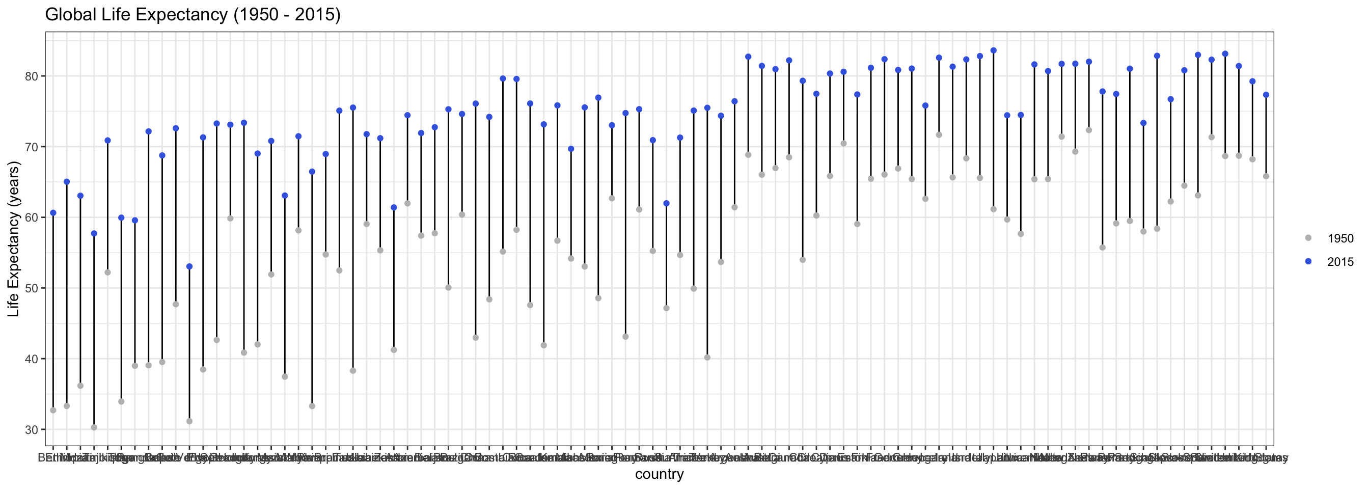
Cleaning up the theme elements a little:
le_plt <- le_plt +
    theme(axis.title.x=element_blank(),
        axis.text.x = element_text(hjust = 1, angle = 90, vjust=0.1),
        axis.ticks.y = element_blank(),
        panel.grid.minor.y = element_blank(),
        legend.title = element_blank(),
        plot.title = element_text(size = 16, face = "bold", hjust = 0.5))

le_plt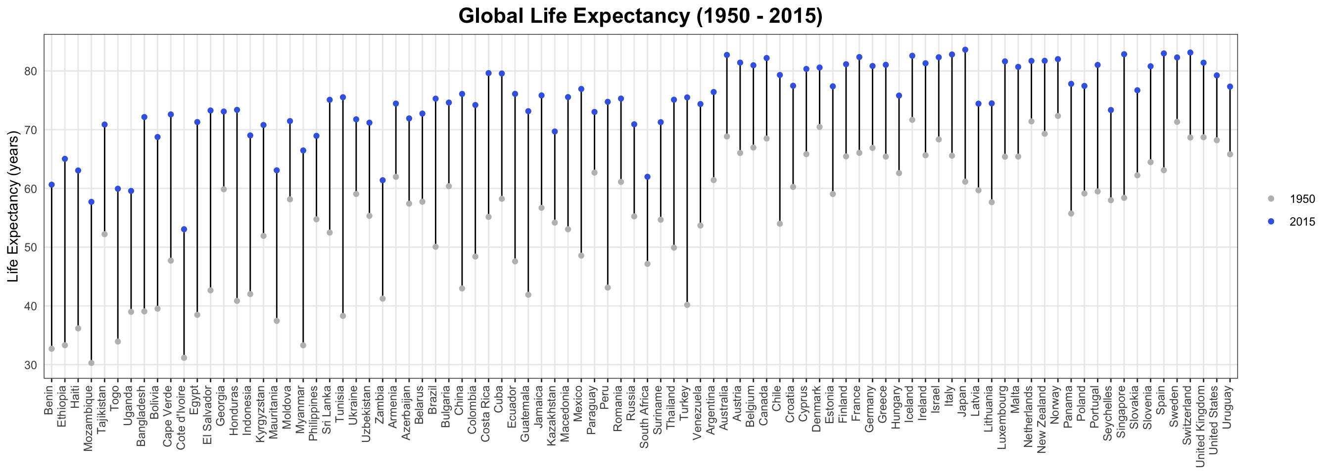
Figuring out where the income groups end (along the x-axis).
cumsum(table(le$incomegroup))## Low income Lower middle income Upper middle income
## 7 26 50
## High income
## 90Adding dividing lines between the income groups using geom_vline:
le_plt <- le_plt +
  geom_vline(xintercept = 7.5, linetype = "dashed", colour = "grey") +
  geom_vline(xintercept = 26.5, linetype = "dashed", colour = "grey") +
  geom_vline(xintercept = 50.5, linetype = "dashed", colour = "grey")

le_plt 
Adding the text for the income groups using geom_text:
le_plt <- le_plt +
  geom_text(aes(4,87,label = "Low Income"), colour = "red") +
  geom_text(aes(15,87,label = "Lower middle income"), colour = "red") +
  geom_text(aes(35,87,label = "Upper middle income"), colour = "red") +
  geom_text(aes(60,87,label = "High income"), colour = "red")

le_plt 