Chicago Employee Salary: Comparison using histograms

Data
This plot uses the chi_emps data frame from package gcubed. The original source of the data is the City of Chicago’s Data Portal6.
First, find the 3 departments with the most salaried employees.
library(gcubed)
library(dplyr)
df <- filter(chi_emps, SalHour == "Salary")
large_dept_names <- names(sort(table(df$Department), decreasing = TRUE))[1:3]
large_dept_names
## [1] "POLICE" "FIRE" "OEMC"large_depts <- df[df$Department %in% large_dept_names, ]
head(large_depts)## # A tibble: 6 x 8
## Name Titles Department FullPart SalHour TypicalHours AnnualSalary
## <chr> <chr> <chr> <chr> <chr> <dbl> <dbl>
## 1 AARO… SERGE… POLICE F Salary NA 101442
## 2 AARO… POLIC… POLICE F Salary NA 94122
## 3 ABAR… POLIC… POLICE F Salary NA 48078
## 4 ABBA… FIRE … FIRE F Salary NA 103350
## 5 ABBA… POLIC… POLICE F Salary NA 93354
## 6 ABBO… POLIC… POLICE F Salary NA 68616
## # … with 1 more variable: HourlyRate <dbl>Code for plot
library(ggplot2)
library(scales) # to add commas to axis values

chi_comp_plt <- ggplot(large_depts, aes(x = AnnualSalary, fill = Department)) +
         geom_histogram(bins = 50, colour = "black") +
         facet_wrap(~Department, ncol = 1, scales = "free_y") +
  theme_bw() +
  scale_x_continuous(label = comma) +
  scale_y_continuous(label = comma) +
  xlab("Annual Salary ($)") + ylab("# of Employees") +
  ggtitle("Annual Salaries of Chicago City Employees (2019)") +
  theme(legend.position = "none", plot.title = element_text(size = 16, face = "bold", hjust = 0.5))

chi_comp_plt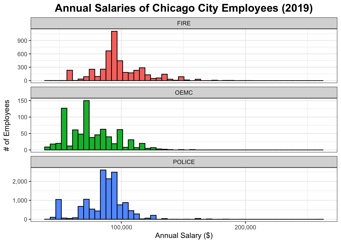
The data was current as of July 2019↩