Global Energy Consumption 2018

Data
This plot uses the energy18 data frame of the gcubed package.
The data set contains energy consumption by country(or groups of countries in some cases) and also has a column identifying that country’s region.
The original source of this data is the BP Statistical Report of World Energy 2019.
The first few rows of energy18 look like this:
library(gcubed)
head(energy18)
## # A tibble: 6 x 8
## Countries Oil `Natural Gas` Coal Nuclear Hydroelectric Renewable
## <chr> <dbl> <dbl> <dbl> <dbl> <dbl> <dbl>
## 1 Canada 110 99.5 14.4 22.6 87.6 10.3
## 2 Mexico 82.8 77 11.9 3.1 7.3 4.8
## 3 US 920. 703. 317 192. 65.3 104.
## 4 Argentina 30.1 41.9 1.2 1.6 9.4 0.9
## 5 Brazil 136. 30.9 15.9 3.5 87.7 23.6
## 6 Chile 18.1 5.5 7.7 0 5.2 3.5
## # … with 1 more variable: Region <chr>Data wrangling for plot
First get totals for each energy source (natural gas, oil, coal, nuclear, hydroelectric, renewable) for each region:
library(dplyr)

df <- group_by(energy18, Region) %>%
  summarise(Oil = sum(Oil),
            `Natural Gas` = sum(`Natural Gas`),
            Coal = sum(Coal),
            Nuclear = sum(Nuclear),
            Hydroelectric = sum(Hydroelectric),
            Renewable = sum(Renewable))
head(df)
## # A tibble: 6 x 7
## Region Oil `Natural Gas` Coal Nuclear Hydroelectric Renewable
## <chr> <dbl> <dbl> <dbl> <dbl> <dbl> <dbl>
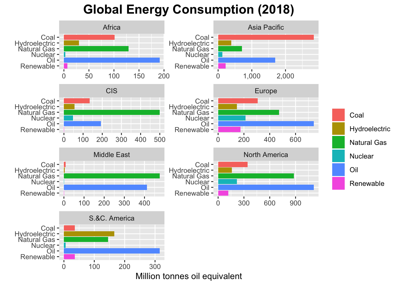
## 1 Africa 191. 129. 101. 2.5 30.1 7.2
## 2 Asia Pacific 1695. 710. 2841. 125. 389. 225.
## 3 CIS 194. 499. 135. 46.8 55.4 0.5
## 4 Europe 742. 472. 307. 212. 145. 172.
## 5 Middle East 412 475. 8.1 1.6 3.4 1.6
## 6 North America 1112. 879. 343. 218. 160. 119.Now use the gather command of the tidyr package to get all the energy values into the same column while creating an accompanying column to indicate the energy source.
library(tidyr)
df <- gather(df, key = Type, value = Energy, -1)

head(df)
## # A tibble: 6 x 3
## Region Type Energy
## <chr> <chr> <dbl>
## 1 Africa Oil 191.
## 2 Asia Pacific Oil 1695.
## 3 CIS Oil 194.
## 4 Europe Oil 742.
## 5 Middle East Oil 412
## 6 North America Oil 1112.The df data frame is now suitable for making the plot.
Code
library(ggplot2)
library(scales) #for formatting the axes labels to have commas e.g. 1,000

df$Type <- factor(df$Type)
energy_plt <- ggplot(df, aes(Type, Energy, fill = Type)) + geom_bar(stat = "identity") +
  facet_wrap(~Region, ncol = 2, scale = "free") + coord_flip() +
  scale_x_discrete(limits = rev(levels(df$Type))) +
  scale_y_continuous(label = comma) +
  xlab("") +
  ylab("Million tonnes oil equivalent") +
  theme(plot.title = element_text(size = 16, face = "bold", hjust = 0.5),
        legend.title = element_blank()) +
  ggtitle("Global Energy Consumption (2018)")

energy_plt