Chicago City Salaries Compared: Density Ridges
Data
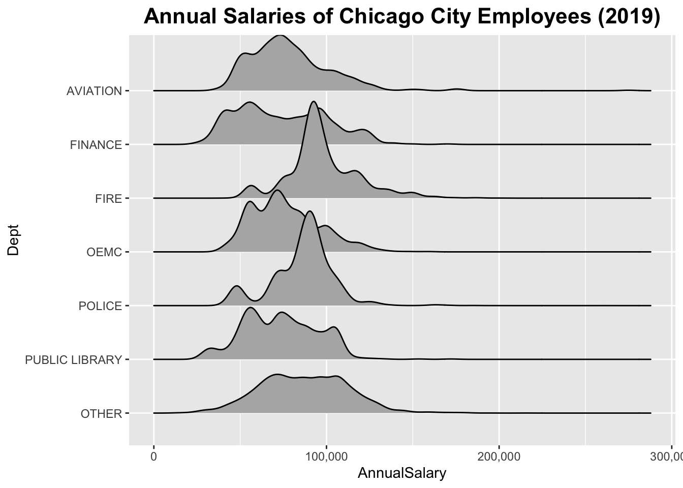
This plot uses the chi_emps data set of the gcubed package. The original source of the data is the City of Chicago’s Data Portal9.
First, get the departments that have more than 500 salaried employees:
library(gcubed)

df <- chi_emps[chi_emps$SalHour == "Salary", ]
dept_counts <- table(df$Department)
large_dept_names <- names(dept_counts[dept_counts > 500])
large_dept_names
## [1] "AVIATION" "FINANCE" "FIRE" "OEMC"
## [5] "POLICE" "PUBLIC LIBRARY"df$Dept <- ifelse(df$Department %in% large_dept_names, df$Department, "OTHER")
table(df$Dept)##
## AVIATION FINANCE FIRE OEMC OTHER
## 583 534 4631 799 4432
## POLICE PUBLIC LIBRARY
## 14060 702Code for plot
dept_levels <- c("OTHER", rev(large_dept_names))
df$Dept <- factor(df$Dept, levels = dept_levels)

library(ggridges) # to use geom_density_ridges
library(scales) # to format axis values with commas

chi_ridge_plt <- ggplot(data = df, aes(x = AnnualSalary, y = Dept)) +
  geom_density_ridges() +
  scale_x_continuous(label=comma) +
  ggtitle("Annual Salaries of Chicago City Employees (2019)") +
  theme(plot.title = element_text(size = 16, face = "bold", hjust = 0.5))

chi_ridge_plt
The data was current as of July 2019↩