Chicago Employee Salary Box plot

Data
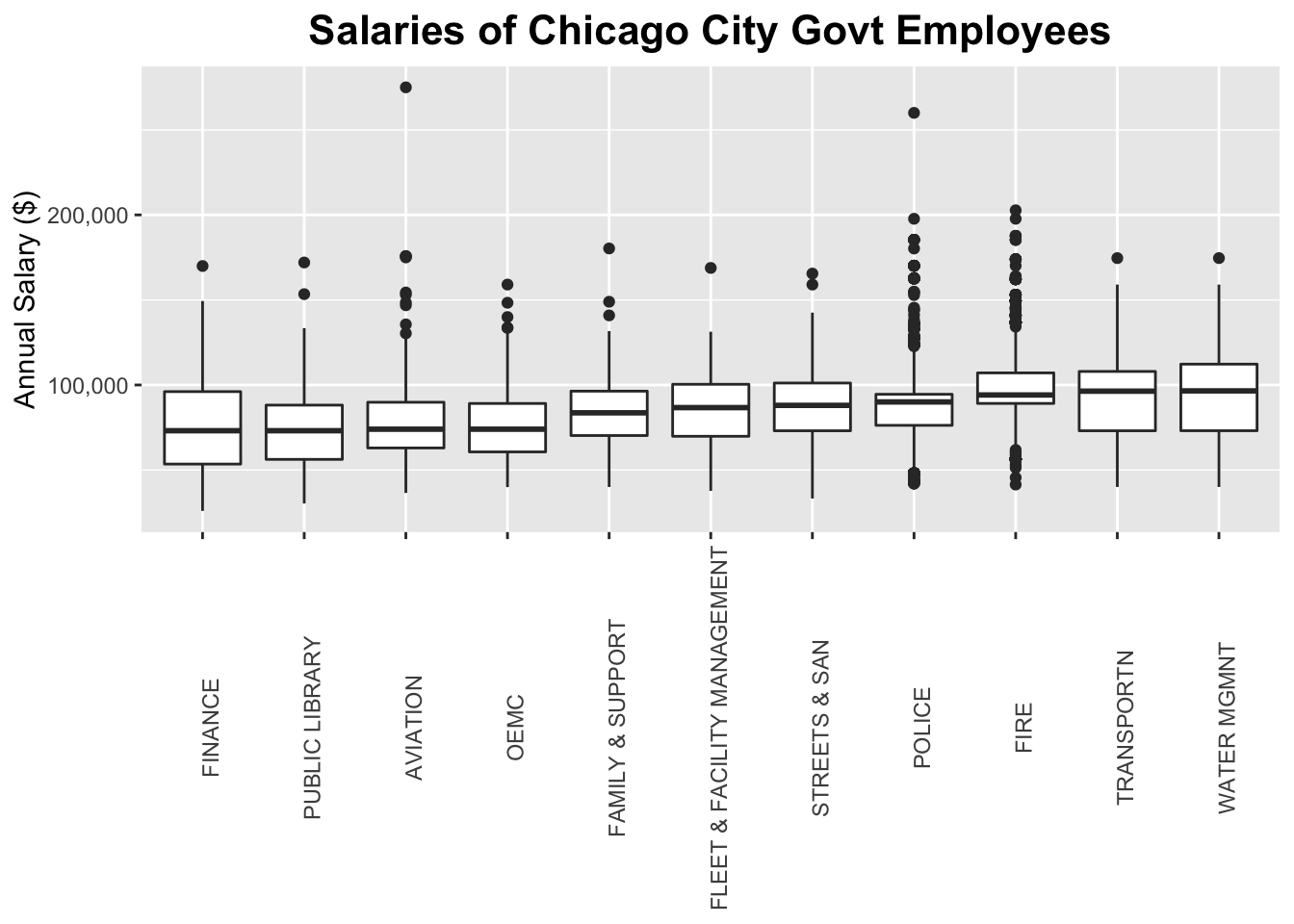
This plot uses the chi_emps data set of the gcubed package. The original source of the data is the City of Chicago’s Data Portal7.
First we identify the departments with 500 or more employees. Then we restrict the data set to those employees that are salaried8.
library(gcubed)
library(dplyr)

dept_counts <- table(chi_emps$Department)
large_dept_counts <- dept_counts[dept_counts >= 500 ]
large_dept_names <- names(large_dept_counts)

large_depts <- chi_emps[chi_emps$Department %in% large_dept_names & chi_emps$SalHour == "Salary",]


sorted_depts <- group_by(large_depts, Department) %>%
  summarise(MedSal = median(AnnualSalary)) %>%
  arrange(MedSal)

large_depts$Department <- factor(large_depts$Department, levels = sorted_depts$Department)
Code for plot
This plot uses the geom_boxplot geometry.
library(ggplot2)
library(scales)


chi_dept500_boxplot <- ggplot(data = large_depts, aes(x = Department, y = AnnualSalary)) +
  geom_boxplot() +
  ggtitle("Salaries of Chicago City Govt Employees") +
  theme(plot.title = element_text(size = 16, face = "bold", hjust = 0.5),
        axis.text.x = element_text(angle = 90),
        axis.title.x=element_blank()) +
  ylab("Annual Salary ($)") +
  scale_y_continuous(label = comma)

chi_dept500_boxplot