Apple Inc Revenue

Data
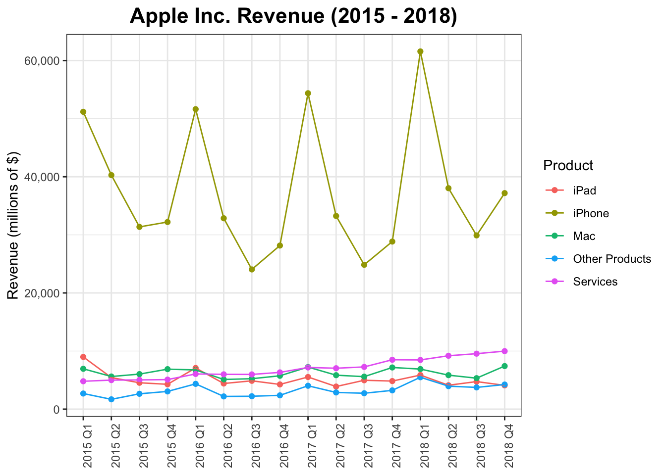
This plot uses the apple data frame of the gcubed package. This data frame contains the revenue (in millions of dollars) for each of Apple’s product lines for the period 2015 to 2018. This data was collated from Apple’s quarterly reports over that period.2
library(gcubed)
head(apple)
## # A tibble: 6 x 5
## Year Quarter Product Units Revenue
## <int> <int> <chr> <dbl> <dbl>
## 1 2015 1 iPad 21419 8985
## 2 2015 1 iPhone 74468 51182
## 3 2015 1 Mac 5519 6944
## 4 2015 1 Other Products NA 2689
## 5 2015 1 Services NA 4799
## 6 2015 2 iPad 12623 5428Code for plot
The code makes use of both geom_point and geom_line as well as group and colour aesthetics.
library(ggplot2)
library(scales) #for formatting the numerical y-axis values

apple_rev_plot <- ggplot(data = apple, aes(x = paste(Year, Quarter, sep = " Q"), y = Revenue, group = Product, colour = Product)) +
  geom_point() +
  geom_line() +
  ggtitle("Apple Inc. Revenue (2015 - 2018)") +
  ylab("Revenue (millions of $)") +
  theme_bw() +
  scale_y_continuous(label=comma) +
  theme(axis.text.x = element_text(angle = 90),
        axis.title.x = element_blank(),
        plot.title = element_text(size = 16, face = "bold", hjust = 0.5))

apple_rev_plot