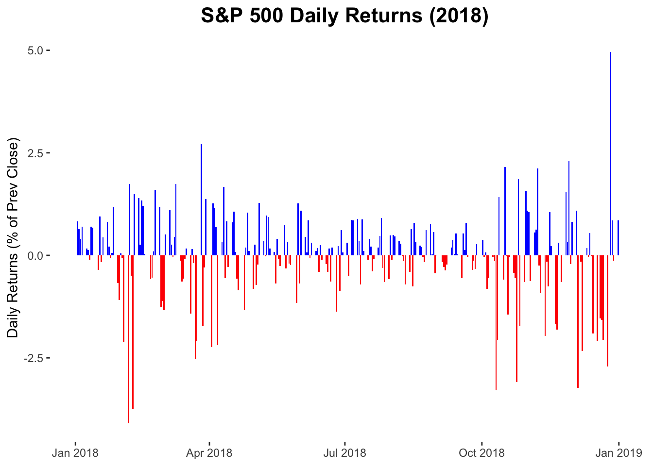
S&P 500 daily returns in 2018
Data
This plot uses the sp500 data frame of the gcubed package.
library(gcubed)
tail(sp500)
## # A tibble: 6 x 12
## Month Day Year Open High Low Close `Adj Close` Volume PrevClose
## <int> <int> <int> <dbl> <dbl> <dbl> <dbl> <dbl> <dbl> <dbl>
## 1 12 21 2018 2465. 2504. 2409. 2417. 2417. 7.61e9 2467.
## 2 12 24 2018 2401. 2410. 2351. 2351. 2351. 2.61e9 2417.
## 3 12 26 2018 2363. 2468. 2347. 2468. 2468. 4.23e9 2351.
## 4 12 27 2018 2442. 2489. 2398. 2489. 2489. 4.10e9 2468.
## 5 12 28 2018 2499. 2520. 2473. 2486. 2486. 3.70e9 2489.
## 6 12 31 2018 2499. 2509. 2483. 2507. 2507. 3.44e9 2486.
## # … with 2 more variables: daily_return <dbl>, abs_ret <dbl>First, we will restrict the data to only those entries from the year 2018. Then we will create a new column, updown that will simply say whether or not each day’s return represented a gain or a loss. This will be used later to colour the bars of the plot.
Code for plot
We will use the geom_bar geometry to create this plot. The fill aesthetic_ will be used to colour the bars appropriately for positive and negative daily returns.
library(ggplot2)

sp18_plt <- ggplot(data = sp18, aes(x = Date, y = daily_return, fill = updown )) +
  geom_bar(stat = "identity") +
  ylab("Daily Returns (% of Prev Close)")+
  guides(fill = guide_legend(override.aes= list(alpha = 0.2))) +
  ggtitle("S&P 500 Daily Returns (2018) ") +
  theme(plot.title = element_text(size = 16, face = "bold", hjust = 0.5),
        panel.background = element_blank(),
        axis.title.x=element_blank(),
        legend.position = "none") +
  scale_fill_manual(values = c("blue", "red"))

sp18_plt